The Zabitat logo represents the modernity and commitment to simplicity that helps to define the brand. It consists of two treatments: the icon and the wordmark, or word treatment.
The Zabitat logo uses three colors: Zabitat blue, gray, and white. The logo should primarily be used on a white background, which provides the most clarity. In cases where the blue logo is not appropriate, the black or white logo can be used.

The guidelines above detail the acceptable and appropriate use of the Zabitat logo. To ensure the consistency and integrity of the Zabitat brand, all modifications are considered improper use.
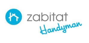
Don't: Add text within the mandatory white space

Don't: Change the color of the logo or wordmark unless otherwise noted
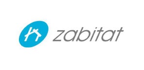
Don't: Change the ratio, skew, stretch, modify or alter the proportions

Don't: Use imagery inside the icon when the word treatment is present
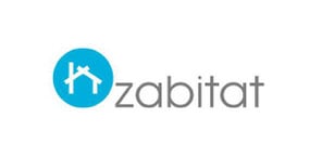
Don't: Move the word treatment from its original position

Don't: Add transparency to the logo
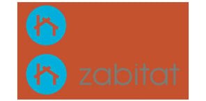
Don't: Use a color background behind the color version of the logo or icon

Don't: Remove the circle from the icon

Don't: Change the shape of the circle icon
© 2024 ODL