Colors
Primary Colors
CMYK: 73, 10, 6, 0
Hex: #00AFDB
RGB: 0, 175, 219
CMYK: 28, 2, 2, 0
Hex: #B1DDF1
RGB: 177, 221, 241
CMYK: 11, 10, 13, 0
Hex: #DFDBD6
RGB: 223, 219, 214
CMYK: 53, 45, 44, 10
Hex: #7B7A7B
RGB: 123, 122, 123
Main Palette:
The variations of blues and greys are the main representations of overall brand. The bright blue is the main recognition color that defines the persona with the lighter blue and greys as supporting colors to help add depth and diversity to brand and marketing content.
The combination of colors provides a glass / water / purity feeling that helps represent a part of the main catalog items.
Secondary Colors
CMYK: 17, 80, 97, 6
Hex: #C4522C
RGB: 196, 82, 44
CMYK: 12, 32, 90, 0
Hex: #E1AD3D
RGB: 225, 173, 61
Supporting Palette:
The additional color of “rust” (shade of orange / red) and of the dark yellow are used as support colors. These colors do not represent the brand directly, but can be used as attention grabbing, eye catching accents in different types of marketing materials.
The colors provide a good contrast against the main color palette which provides a good break in color experience, making them great for using in call to actions throughout marketing material when used appropriately.
Color Usage
The bright blue is the most brand defining color of Zabitat. It should always be the most distinctive color when dealing with the marketplace and installation services sector of the business.
The blue should be used in two methods:
- Standalone - no other colors
The blue should stand alone as it creates a clean, sleek, and consistent experience when viewing a piece of marketing content. It should not be embeded, blended, surrounded, touching, or transparent with any other colors. The only colors that should be touching the blue directly should be white, unless it is directly touching an image. - Main Palette - support colors defined on the main palette
The support colors from the main palette can be used to compliment the blue. However, the supporting colors should again not be touching any other colors. When using the supporting colors, the only other colors that should be touching should be white, unless it is directly touching an image.
Adjusting opacity of the color palette is not encouraged unless it is a horizontal overlay on the top or bottom of the image. Vertical or angled transparent colors is not recommended.
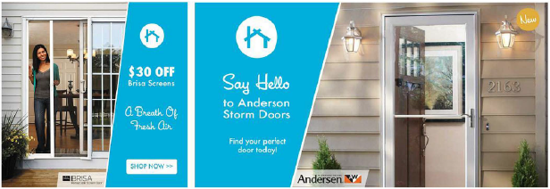
The yellow is used as a call-to-action and attention grabber. It is designed to stick out drastically from the other colors used on the marketing material to draw your eyes to something specific. It is best practice to create a white barrier that separates the yellow from other colors to make sure it does not touch. Notice the white lines used to separate the yellow from other colors from color palette. This is not required for when the yellow touches images.
Rules:- Utilize a white barrier to separate the yellow from the other colors (with the exception of dark background colors.)
- Do not use other colors as the text color inside a yellow background. Only use black or white.
- Do not use any other colors from the supportive color palette on the same marketing material.

The rust should be used similar to the yellow. It is used as a call-to-action and attention grabber. It is designed to stick out drastically from the other colors used on the marketing material to draw your eyes to something specific. It is best practice to create a white barrier that separates the rust from other colors to make sure it does not touch. Notice the white lines used to separate the rust from other colors from color palette. This is not required for when the rust touches images.
Rules:
- Utilize a white barrier to separate the rust from the other colors.
- Do not use other colors as the text color inside a rust background. Only use black or white.
- Do not use any other colors from the supportive color palette on the same marketing material.
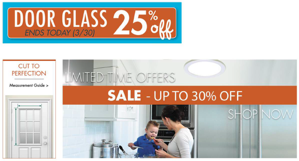
Color Misuse
- Do not use more than 1 color from the supporting palette options on the same marketing material.
- Do not use text colors on top of color palette options.
- Do not embed CTAs without creating a white stroke/barrier between colors.
- Do not add transparency to colors on top of other colors.
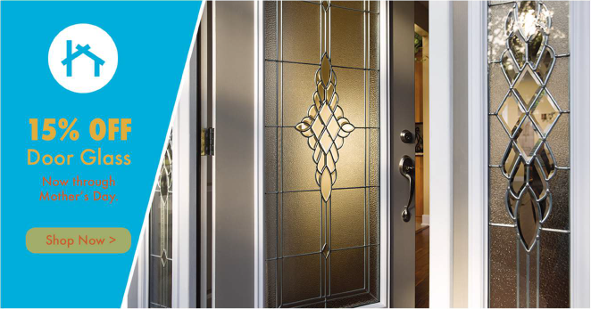
Typography
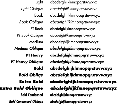
Corporate font
Futura, the Zabitat Corporate font
Logo font
TeX Gyre Adventor, the Zabitat Logo font

Consumer font
Housearama League Night, the Zabitat Consumer font

Imagery
Promotional Examples





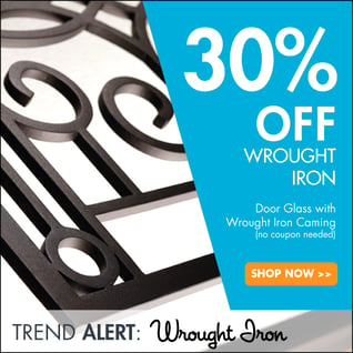
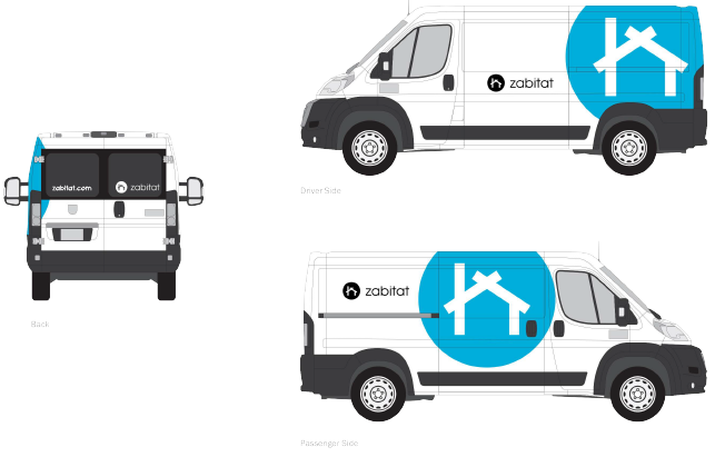
Truck Application
