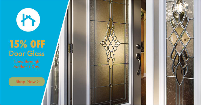
The variations of blues and greys are the main representations of overall brand. The bright blue is the main recognition color that defines the persona with the lighter blue and greys as supporting colors to help add depth and diversity to brand and marketing content.
The combination of colors provides a glass / water / purity feeling that helps represent a part of the main catalog items.
The additional color of “rust” (shade of orange / red) and of the dark yellow are used as support colors. These colors do not represent the brand directly, but can be used as attention grabbing, eye catching accents in different types of marketing materials.
The colors provide a good contrast against the main color palette which provides a good break in color experience, making them great for using in call to actions throughout marketing material when used appropriately.
The bright blue is the most brand defining color of Zabitat. It should always be the most distinctive color when dealing with the marketplace and installation services sector of the business.
The blue should be used in two methods:
Adjusting opacity of the color palette is not encouraged unless it is a horizontal overlay on the top or bottom of the image. Vertical or angled transparent colors is not recommended.

The yellow is used as a call-to-action and attention grabber. It is designed to stick out drastically from the other colors used on the marketing material to draw your eyes to something specific. It is best practice to create a white barrier that separates the yellow from other colors to make sure it does not touch. Notice the white lines used to separate the yellow from other colors from color palette. This is not required for when the yellow touches images.
Rules:
The rust should be used similar to the yellow. It is used as a call-to-action and attention grabber. It is designed to stick out drastically from the other colors used on the marketing material to draw your eyes to something specific. It is best practice to create a white barrier that separates the rust from other colors to make sure it does not touch. Notice the white lines used to separate the rust from other colors from color palette. This is not required for when the rust touches images.
Rules:


© 2024 ODL