Blink is a bright, friendly, and optimistic brand and the logo typemark should reflect this in a unique and easily recognizable way. This vertical blue logo is the primary Blink logo. If the primary logo is determined to be inappropriate, alternative logo designs may be employed based on considerations such as color, printing specifications, and maintaining balance and consistency in the images.
The primary logo in all approved colors includes the endorsement "An ODL Brand." Use of the alternate logo without the endorsement is permitted only when the ODL logo or icon is present and within reasonable viewing area, and with approval from the Blink marketing team. For questions on appropriate usage of the Blink logo, please contact marketing@odl.com.
The Blink logo uses three colors: Blink blue, gray, and white. The logo should primarily be used on a white background, which provides the most clarity. In cases where the blue logo is not appropriate, the gray or white logo can be used.
Blink Font Type: Arial Rounded
Blinds + Glass Font Type: Oxygen
This is an alternative logo without a box containing the typemark. This alternate version is not to be used as the primary logo.
Use of the Blink alternative logo must be approved by the Blink Marketing team.
In instances where Blink wants to be a part of a logo lock-up with another brand, certain standards must be maintained.
The two logos should:
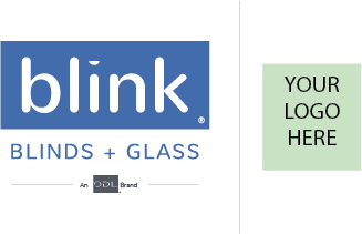
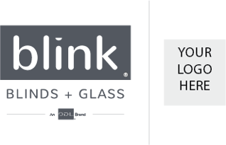
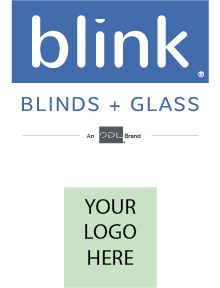
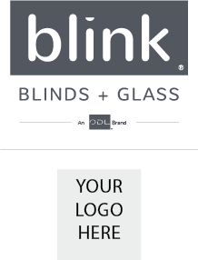
White space should be maximized
whenever possible.
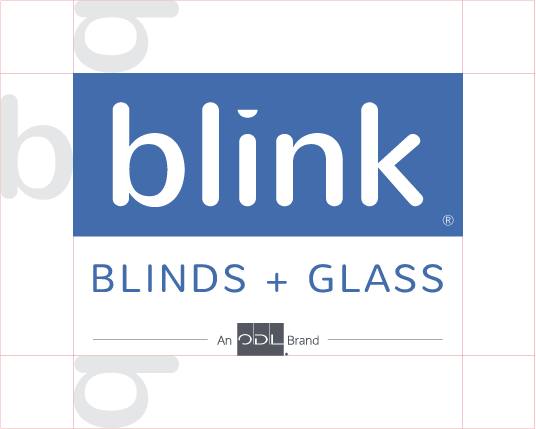
The minimum clearance around the logo is represented by the height and width of the first ‘b’ in Blink.
The Blink logo may only be reduced to a certain size. Legibility should always be the priority and enforcing this minimum will ensure this standard.
Minimum size -40 px height on screen | .5 inches height in print
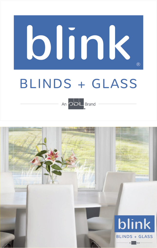
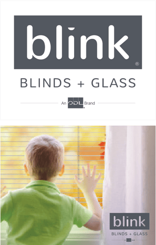
The logo should typically be used on a white background. This ensures legibility and clarity. In circumstances where the white background does not fit, use a background or photo that provides the best contrast with the logo and refer to the following guidelines:
1. Use the reversed white logo on dark photos or backgrounds
2 Use the dark gray or blue logo on lighter backgrounds or photos
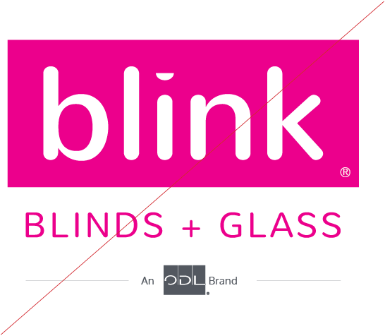
Don’t: Change the Color from other than the approved colors
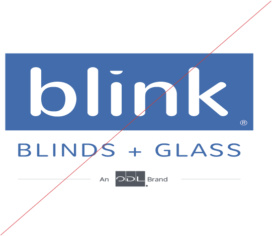
Don’t: Change the ratio, stretch, modify or alter the proportions
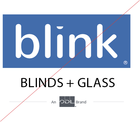
Don’t: Change, replace or alter marks in any way
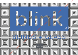
Don’t: Surround or overlay the mark with a pattern or busy design
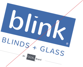
Don’t: Rotate the mark
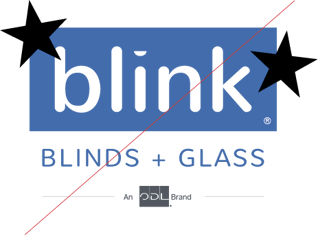
Don’t: Add graphics
© 2024 ODL