Logo
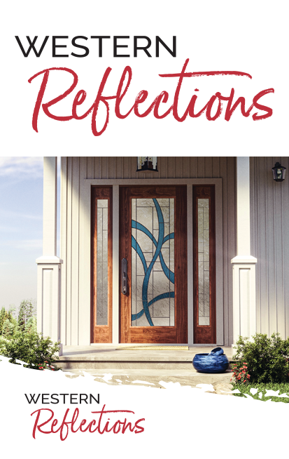
Lockup


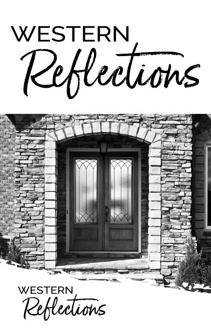
Alternative Backgrounds

Clearance & Sizing

Improper Use
Don't: Change, replace or alter marks in any way
Don’t: Change the ratio, stretch, modify or alter the proportions
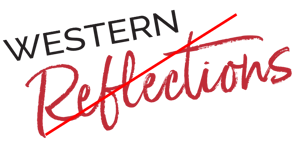
Don’t: Rotate the mark
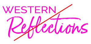
Don't: Change the color to an unapproved color
Don’t: Surround or overlay the mark with a pattern or busy design
Don’t: Add graphics