Primary Colors
Pantone: 187
CMYK: 0, 91, 72, 23
Hex: #BF2F38
RGB: 191, 47, 56
Pantone: Process Black
CMYK: 0, 0, 0, 100
Hex: #272727
RGB: 39, 39, 39
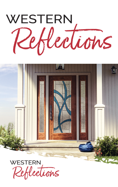
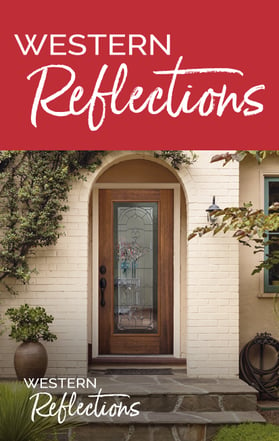
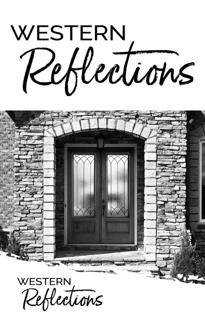
Western Reflections Red and Black
These colors are the only approved primary colors for Western Reflections. All associated collateral should use the format-appropriate codes to ensure the correct color is in use.
Secondary Colors
CMYK: 0, 19, 89, 0
Hex: #FFCE34
RGB: 255, 206, 52
CMYK: 63, 10, 40, 0
Hex: #5EB2A5
RGB: 94, 178, 165
CMYK: 25, 10, 60, 0
Hex: #C5CC83
RGB: 197, 204, 131
CMYK: 11, 71, 52, 0
Hex: #D96A6A
RGB: 217, 106, 106
CMYK: 89, 69, 40, 14
Hex: #3A526F
RGB: 58, 82, 111
Alternative Colors
In addition to Western Reflections Red and Black, these are the only other approved colors that may be used in Western Reflections branding. The format appropriate code should be copied to ensure the correct color is in use.


