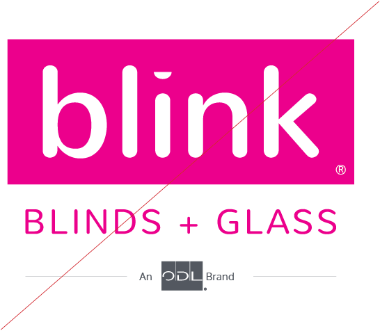
Logo
Primary Logo
![]()
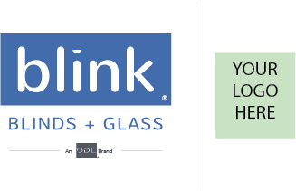
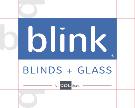
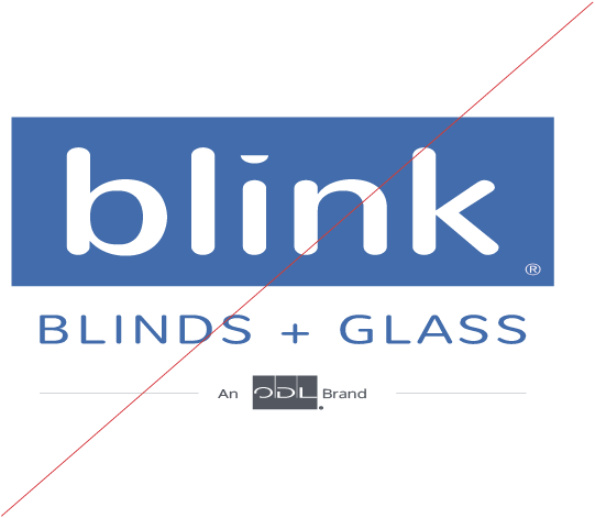
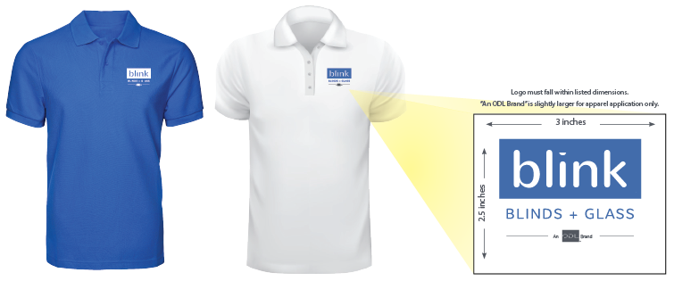
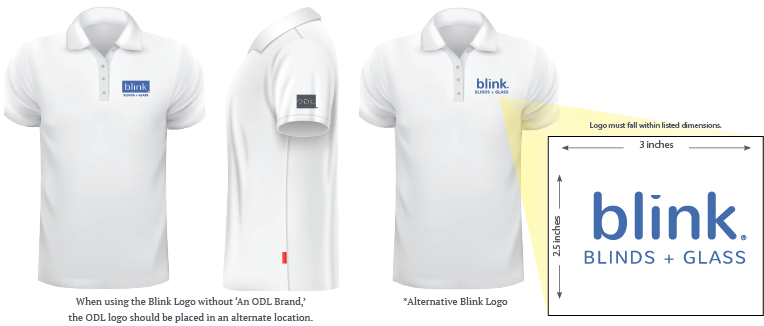
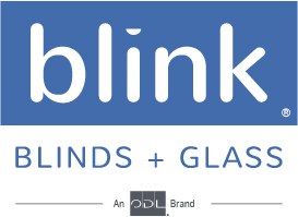
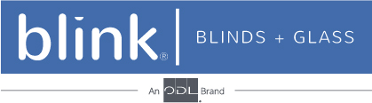
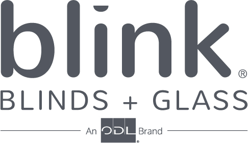
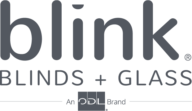
Blink is a bright, friendly, and optimistic brand and the logo typemark should reflect this in a unique and easily recognizable way. This vertical blue logo is the primary Blink logo. If the primary logo is determined to be inappropriate, alternative logo designs may be employed based on considerations such as color, printing specifications, and maintaining balance and consistency in the images.
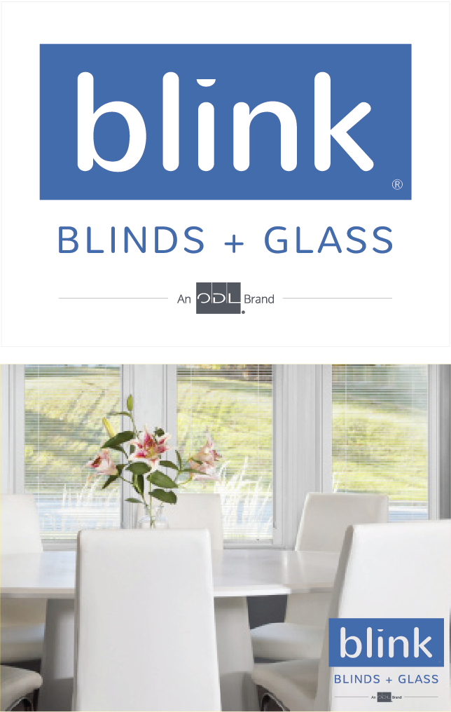
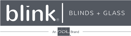
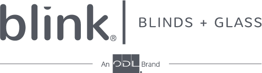
The primary logo in all approved colors includes the endorsement "An ODL Brand." Use of the alternate logo without the endorsement is permitted only when the ODL logo or icon is present and within reasonable viewing area, and with approval from the Blink marketing team. For questions on appropriate usage of the Blink logo, please contact marketing@odl.com.
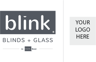
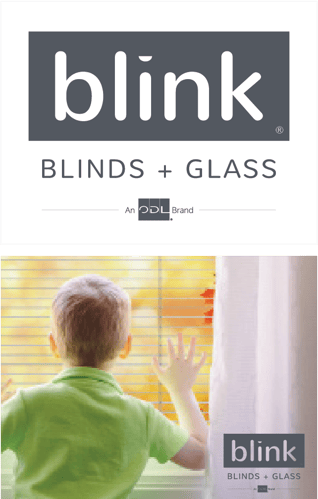
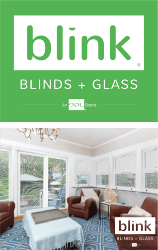
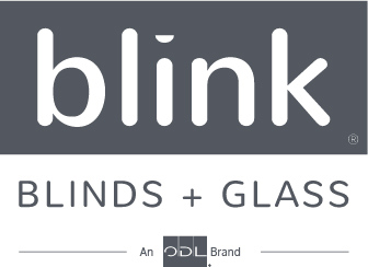
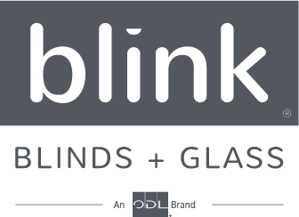
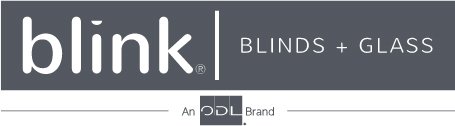
Alternate Logos
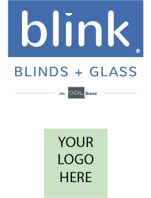
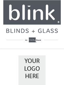
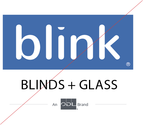
Logo + Lockup
Clearance and Sizing
Alternative Backgrounds
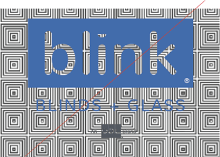
Improper Usage
Don’t: Change the Color from other than the approved colors
Don’t: Change the ratio, stretch, modify or alter the proportions
Don’t: Change, replace or alter marks in any way
Don’t: Surround or overlay the mark with a pattern or busy design
Don’t: Rotate the mark
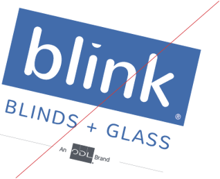
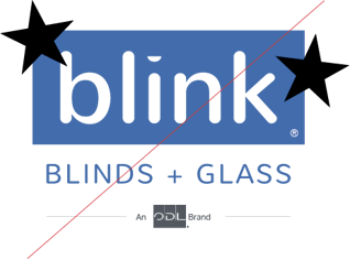
Don’t: Add graphics


